‘Star Wars The Force Awakens’ Early Art Shows a Different Movie
Early concept art for “Star Wars: The Force Awakens” reveals a much different film!
“Star Wars: The Force Awakens” hit theaters months ago but there’s no doubt that its impression is one that will last forever. But with all of the anticipation leading up to the film and praise after it arrived, many continue to look to the future rather than explore the past.
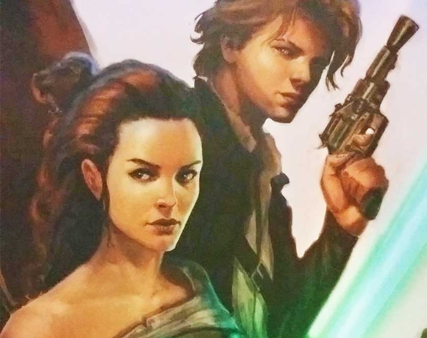
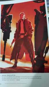
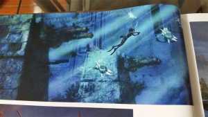
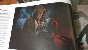
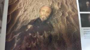
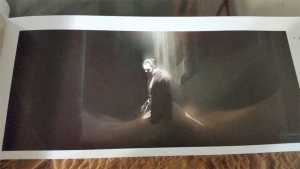
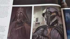
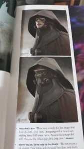
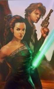
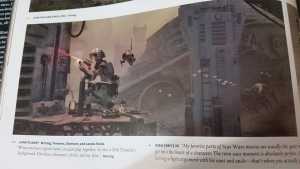
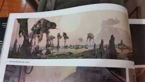
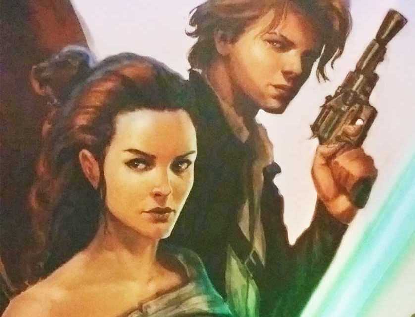
Just before the film’s premiere came a book titled “The Art of Star Wars: The Force Awakens” which contained quite a few pieces of concept art that lead up to the film’s release. The concept art showed a different version of the two main characters Finn and Rey, more Luke Skywalker, a more “western” Han Solo, and even an underwater Death Star. Take a look at the images below.
Before the film released there was some other concept art that leaked and gave some insight into the film. But now there are a lot of interesting (to say the least) ideas that could have been pursued based on this current art. The idea that Finn and Rey’s names could have been Sam and Kira and the change of race could have been interesting twist. The story may have been the same but they could have explored a different relationship like brother and sister. Not to mention, the name Kira could have been taken from Akira Kurosawa which “Star Wars” was said to have borrowed ideas from.
The Han Solo look doesn’t seem to stray too far from what the original character has always been. The mention of Jeff Bridges in “True Grit” is fitting for the evolution of what Solo could have been and I do think that facial hair would have been an interesting touch.
The prevalence of Luke Skywalker in these photos truly comes as no surprise. The rumors we’ve heard about Disney wanting more Luke and JJ Abrams not may be a reason why this concept art exists yet Luke’s presence is so minimal in “The Force Awakens.”
The final and most intriguing art is probably the difference in landscapes we see. The “junk planet” where Rey (or this case Kira) resides looks much different than Jakku which resembles Tatooine. The broken down AT-ATs and Star Destroyer look awesome in this swamp-like wasteland but could have been deemed “overkill” by the studio. Out of all the landscapes, I think the biggest moment of surprise came from the underwater Death Star art. Weren’t both Death Stars destroyed? And by destroyed I mean they were mechanically eviscerated. So was this another Death Star that was in the process of being built?
The concept art for any film always throws things for a loop. What could have been, what never was, and what should have been are all discussions to be had. For now we’ll just have to appreciate what we have and hope that some of these concepts make their way into future films.

