Great Movie Posters with Matt: Second Installment
Time for some movie poster fun with the awesome, amazing and absolutely crazy…
Let’s hop into this month’s 10 great movie posters!
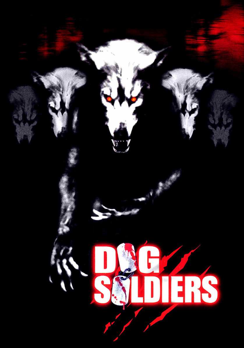
Dog Soldiers
As one of my favorite horror and werewolf movies of all time, it only seemed right to dig out its movie poster and show it off. To a typical passer-by, one just skimming through the DVD section of Best Buy or Target, they might see a creepy V-shaped formation of werewolves concealing what is probably a terrible B-style horror movie underneath. Yes, the poster and its art does come off as cheap and looks like it was thrown together in five minutes, but that doesn’t erase its ability to cause you to wonder about the movie. I first saw “Dog Soldiers” on the SyFy channel a long time ago, so I didn’t have the pleasure of examining the poster/DVD cover before my first viewing. Although, the day after the movie amazed me, I was at Best Buy searching high and low for a copy. It took me awhile, but I eventually caught the red eyes and the werewolf heads in the background. The bottom half of the DVD was covered by a flipped-over copy of “50 First Dates,” probably left by some heartless patron. Those red eyes and the werewolf heads were all the evidence I needed to understand I found my prize, mainly because the skin-crawling fear the cover gave me on my first glance is the exact same feeling the movie gave me the night before. My hands moved “50 First Dates,” sitting its case upright in the process, and grabbed my copy of “Dog Soldiers.” My eyes glanced over it for several minutes, and all my lips could speak were the simple words, “Perfect cover.”
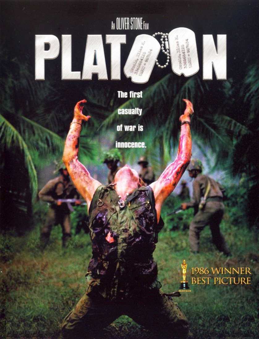
Platoon
This is a very iconic movie poster in the film world. Even if you’ve never seen “Platoon,” I’m certain you’ve seen Willem Dafoe’s painful and somber “reach for the heavens” flash across the screen during the Oscars or Golden Globes. The poster tells you everything you need to know about the movie before ever watching a frame. It’s a war story filled with violence, pain, suffering, hopelessness, sadness, and the loss of innocence. Without seeing Willem Dafoe’s face, the dying soldier reaching for the heavens represents all the innocence and young men and women lost during wars, regardless of race or nationality. The poster tells you it’s not a movie for the faint of heart, and that there will be nothing but ruthlessness during its runtime, hence why the soldiers in the background are already moving on to their next target before the unknown soldier’s body hits the ground.
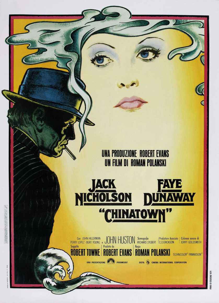
Chinatown
Being one of the best film noirs of all time, it’s only proper for the poster to fit the bill as well. Very reminiscent of its counterparts from the 40s and 50s, this poster gets you ready for a story filled with deception, mystery, betrayal, and horror. The fact that it’s drawn and painted instead of a simple photo, or a photoshop project, breathes life into the dark themes and even darker backstory filling the setting where “Chinatown” takes place. It’s just an overall cool poster, the type you really don’t see nowadays. That could be because the film noir genre isn’t too popular anymore, at least when you talk about the “classic” style, but hopefully one day the genre will once again receive the rejuvenation and popularity it deserves. And hopefully we’ll see excellent pieces of art cover their stories and entice people to watch, just like how this one does here.
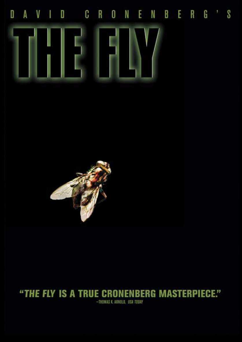
The Fly
There was a toss-up when I was choosing a poster for “The Fly.” The other one shows the machine, the teleport that kickstarts the film’s story, and coming out of it was a man’s arm and a human-sized fly leg, which were obviously connected to a blurry figure deep within the machine. I liked that one because it properly introduced you to what the film would be about, but I believe that’s why I didn’t choose it in the end. Move posters that don’t give away the story and keep things a mystery are the best ones in my eyes. So, that’s why the one you see above was chosen. It’s a pure black background with a lone, and normal looking, fly occupying the abyss. It just drips with mystery and induces you with a hunger for answers, making you reluctantly want to journey through the story and its emotional ending. It’s simple and powerful, nothing else to say here.
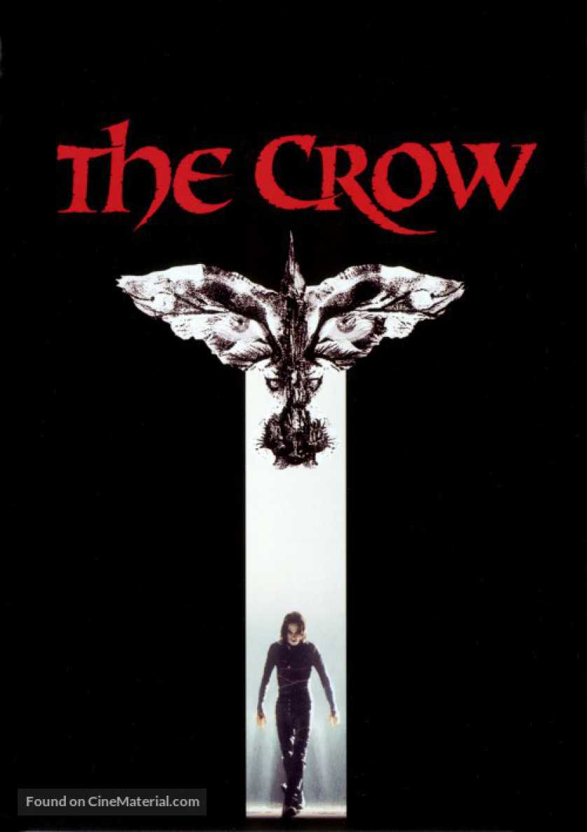
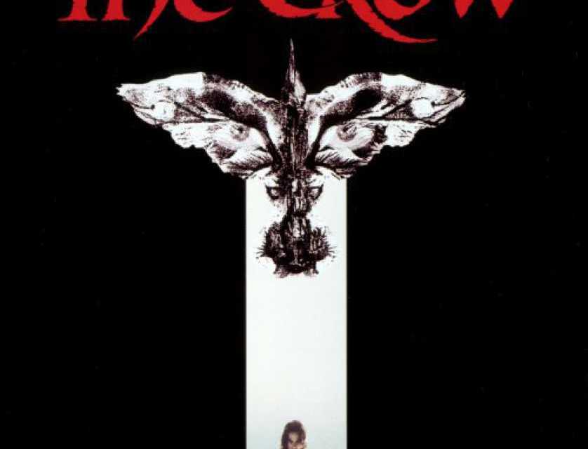
The Crow
There’s a lot that can be said about this one, right down to where some have said this represents Brandon Lee’s entrance into Heaven and into our hearts. I believe every movie poster’s meaning and impact can be studied and argued, but in the end it all comes down to one’s own opinion and how they feel about it. I personally love this poster because of its style and gothic look. “The Crow” should’ve honestly been a one movie universe, instead of having terrible remake after terrible sequel be pumped out until “The Crow” universe is now considered to be cursed. Curses or not, this poster makes you wonder what the heck this movie is about. It makes you want to examine it for more than just a glance and/or pick up the DVD and read the back cover, where you’ll try to decide whether or not its worth a watch. The poster does its job well of enticing people to at least give it more than a mere peek as they walk by. Even if a buyer or potential viewer decides to brush it aside after careful consideration, at least the poster entices people to consider it rather than totally disregard it. In no way does it spoil the events of the movie or its genre. All you get is a mysterious figure walking into darkness from the light, and he looks like he has a dangerous agenda. Awesome.
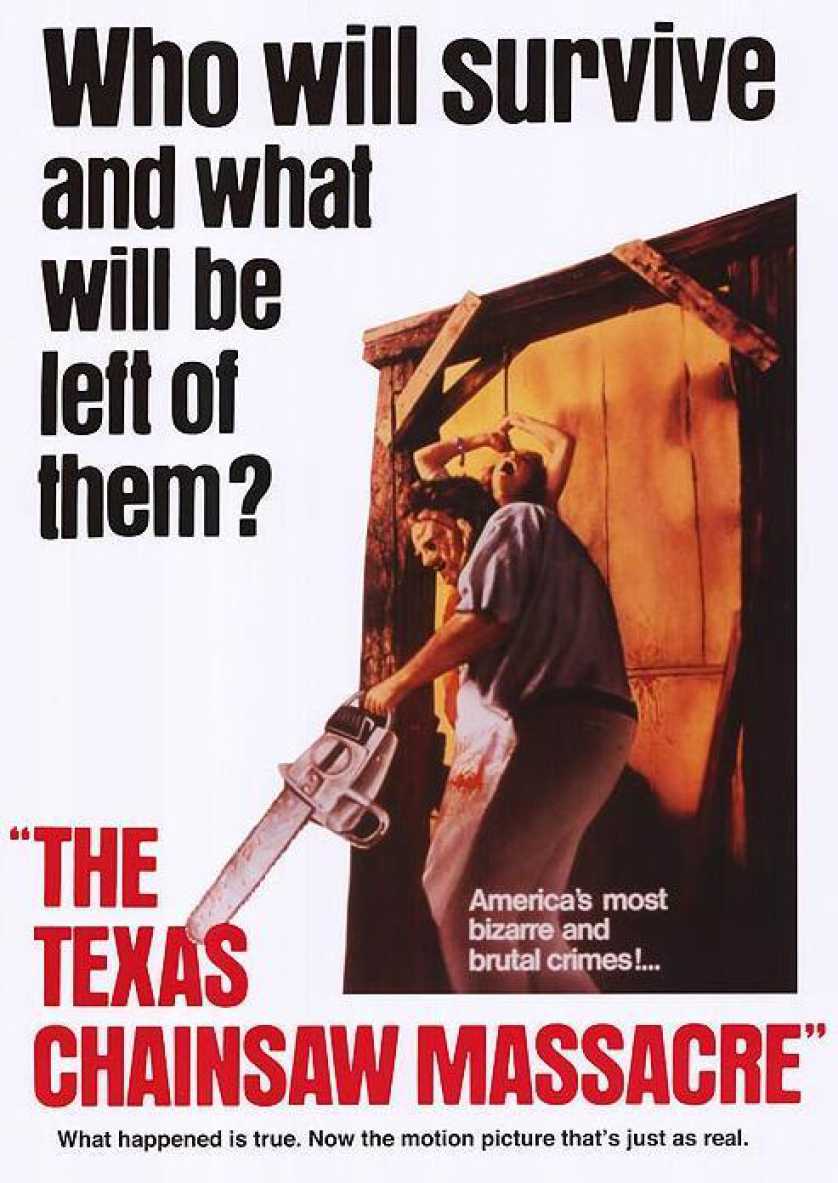
The Texas Chainsaw Massacre
I don’t think there’s a need to discuss how disturbing and frightening this one is. Seeing a masked-man with a chainsaw leaving a screaming woman attached to a chain is all you need in order to tell people, “Hey, get ready for a pretty messy roller coaster.” Just from the poster, it’s easy to understand this movie is about some serial killer going after young, beautiful people, but it still leaves everything in between, especially the gruesome details, up to the imagination. What I particularly admire about this poster, besides its brutal image, are the three slogans surrounding the picture and title. They almost act like the master of ceremonies or the guy outside the haunted house at the carnival, attempting to entice you to enter if you dare. I love it. It’s a movie poster warning you through subtle methods, ones that say “Come in. Come in. But viewers beware, you’re in for a scare” (I’d like to thank Goosebumps for that slogan).
Amadeus
For the longest time, I did not watch this movie because of its poster and title. It took me a very, very long time to figure out it was about Mozart, mainly because I forgot his first name was Amadeus. It always appeared to be a movie only my parents would like, and with just one look at the poster, I’m sure you completely understand why my 10-year-old self thought so. Now that I’m older and have seen the movie, this poster speaks higher volumes than ever before. Volumes that exalt the themes of madness and murder, which highlight this film beyond any belief. Interpretation and discussion will cloud this one forever, particularly about whether the large figure is Salieri and the small white figure in his hat is Mozart. There are plenty of theories and in-depth meaning behind this one, but I like to look at it as, just like “Texas Chainsaw Massacre’s” slogans, the master of ceremonies is opening his arms and inviting you to come enjoy a story about jealousy, music, madness, and murder.
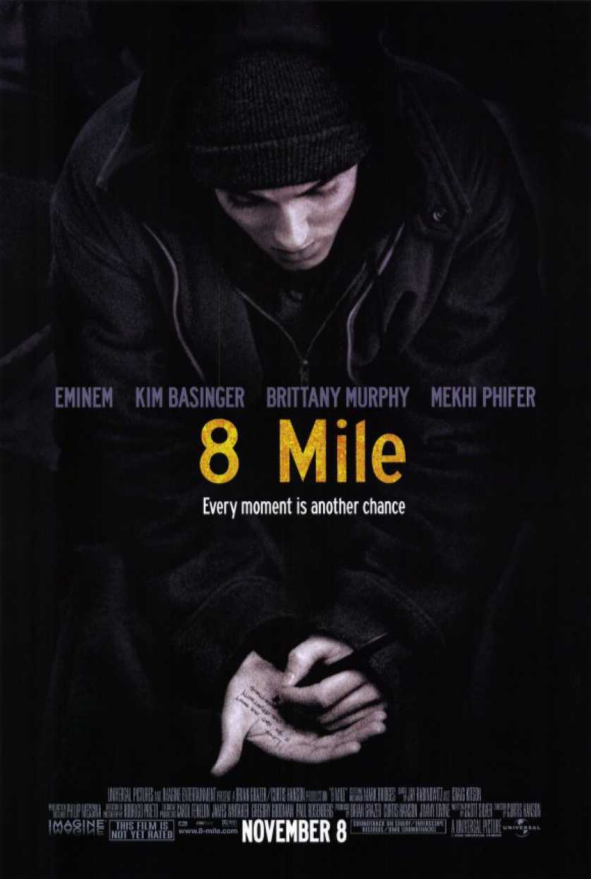
8 Mile
This one is most likely on here because I am a big Eminem fan, even though his latest music isn’t all that great. This poster is more of a source of nostalgia for me than a piece of artwork, but it still holds a powerful image in my mind. Let’s say you didn’t know who Eminem was and this was your first time seeing this movie poster. All you get is a guy writing words on his hand and, unless you grew up in or around Detroit, the ambiguous title “8 Mile.” “Not too great of a poster,” is probably what you’re telling yourself, and I don’t blame you, but examine it more and you start to feel and understand the power beneath the image. Why isn’t this guy writing on paper? Why is this guy concentrating so hard on these words? Why doesn’t type on a computer? This one image raises questions while dripping with tones of desperation, talent, and a hunger for something more than a normal life. My interpretation is, of course, sabotaged by my admiration and knowledge of Eminem, but I still believe I’d understand the poster’s powerful image even if I wasn’t a fan. I’ve grown to look at it as more than the poster for Eminem’s movie and look at is as the first glimpse into Jimmy Smith Jr.’s desperate and painful world.
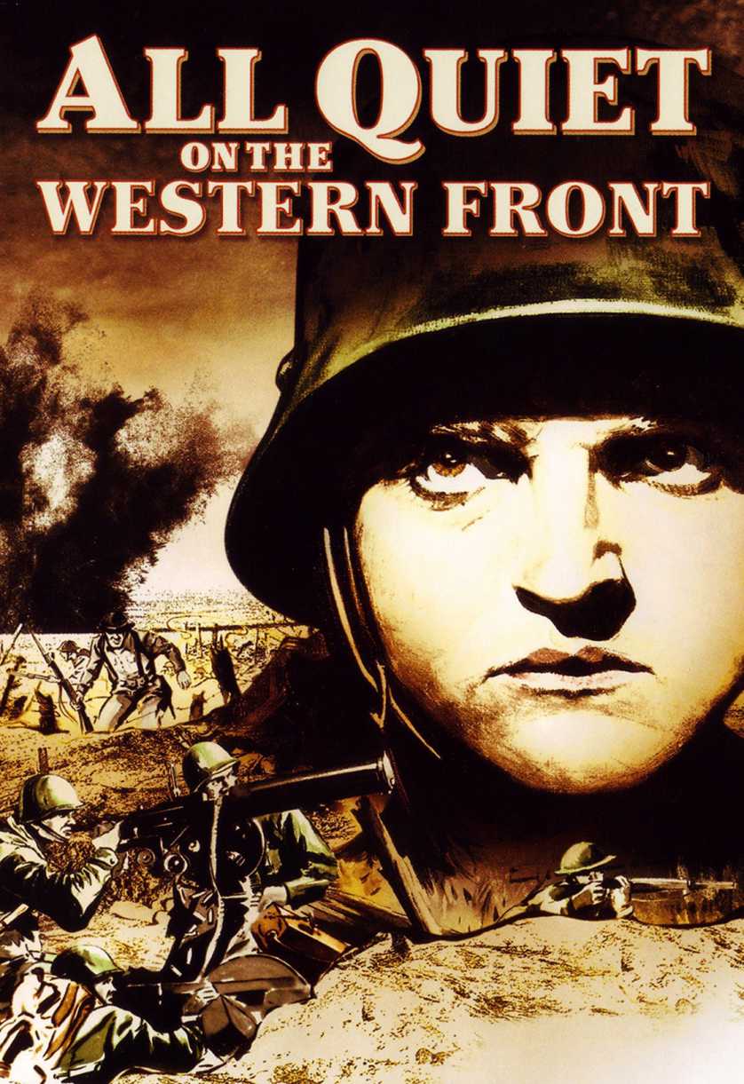
All Quiet on the Western Front
There were two factors that first got me to watch “All Quiet on the Western Front.” The first is the fact that it won best picture at the Oscars. The next is because of this very image. Maybe I was going through a phase where I only watched war movies or something, but this poster’s hand-drawn images, detailing the horrors and hardships of war, caught my eye and wouldn’t let go. It didn’t make question what war it was about or what faction or country it was about. The poster simply made me want to watch and endure what was underneath. The poster mashes friends and foes together, helping to acknowledge several of the film’s dark and unforgiving tones. I always search for a hidden beauty within a movie poster, and the hidden beauty I find within this one, every time I look at it, is one of lost adolescence.
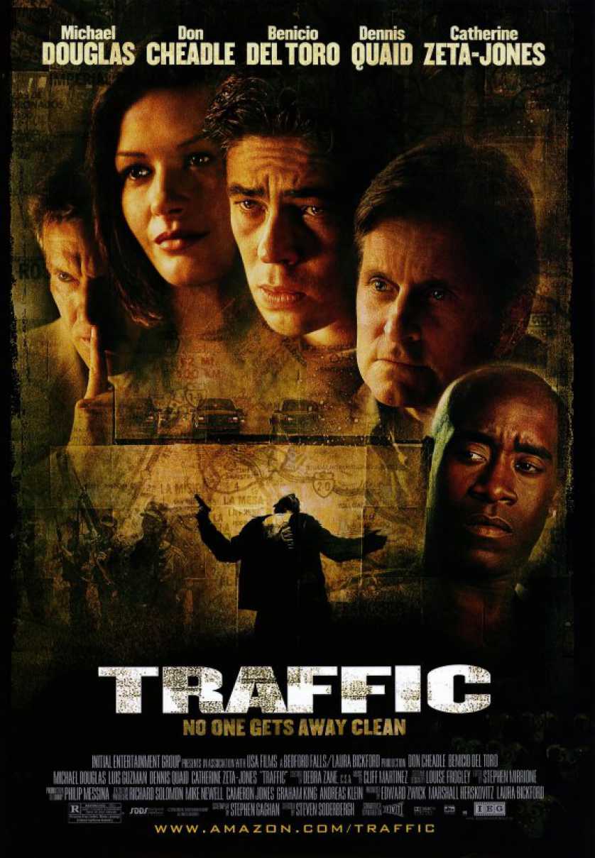
Traffic
Other than the famous “Halloween” posters and 90s teen horror movie posters, I’ve never been a fan of what I like to call the “trail of actors” on movie posters. You know what I’m talking about. The posters where all the heads of the popular actors curve, in succession, around the cover, creating a weird human-headed centipede creature. There are plenty of them, just go look at “The Faculty” and “Halloween: H2O” for more examples. Well, for those two movies, it was the cool thing to do, but then every kind of movie (dramas, comedies, thrillers, romances) started doing it, which eventually ruined the style. The style, when speaking about it within the horror genre, always said to me, “Here are the offerings. Which ones will the killer kill?” That worked extremely well, but when movies like “Traffic” would reach for the same excellence, they usually fell short. “Traffic,” somehow, does it right. There’s a somber beauty to this image, particularly because of the man being shot right in the middle. The heads don’t come off as “Hey, Look who’s in this film!” They come off just like they would on a horror film’s poster, allowing some ambient voice to call down and say, “Here are the offerings. Which of their lives will be taken?” Which is only a very appropriate saying for an unforgiving, powerful, and disorienting film like “Traffic.”
In Conclusion…
I do hope you enjoyed this article today. It was a blast looking through all the posters I love and selecting the choice few for the list you just read through. If you got this far and are reading this right now, then I know I did my job right, so stay tuned for the next adventure down the yellow brick road of posters, and please feel free to discuss any of these and/or any of your favorite posters.

