
The Top 5 Worst Changed DVD Covers
Some may remember an article by Matt on the subject of movie posters, well DVD covers also have a problem of a dying art.
Let’s look at the most egregious examples of ruining perfectly good DVD covers. These aren’t in any particular order and the only rule is that it has to be a new piece of art created for a new release, not just the companies using an alternative poster for the DVD.
5.) The Hunt for the Red October
Based off the Tom Clancy bestseller of the same name, we have the story of a famous Russian submarine captain (Sean Connery) defying orders to steal his country’s newest and most advanced sub to defect to America. However, this is extremely risky as no one else knows his plan. The only one to figure it out is Jack Ryan who must make his government understand to not cause an international incident. The original poster for “The Hunt For the Red October” is iconic. While it’s mostly just Sean Connery’s face with the sub in the background all in red it is a very striking image. It’s hard to describe why, but it does get the mood of the film down.
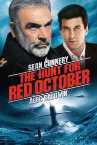 After the change though, this one is the first example I can remember coming across in a store, an FYE to be exact. I just barely noticed it as I was thumbing through stuff. The new cover makes it look like a cheap copy. I suppose since Alec Baldwin’s Jack Ryan is the actual main character they wanted to add him to the cover, but it just looks awful and is a bad photoshop job. Warning all of these entries will have that same photoshop problem.
4.) Near Dark
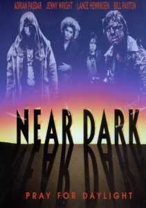
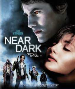
This one is almost funny in how they try to change it into something else. Now this is a case where the original art isn’t the greatest, but they do work to try to include the famous image of Bill Paxton’s character with his head cracked open. For those who haven’t seen it “Near Dark” is about a young man who after hooking up with a woman who turns out to be a vampire, is turned into one as well and is then welcomed into the fold of a nomadic tribe of what is often referred to as cowboy vampires. This is a horror film and vampire tale, but it is firmly set in tone and aesthetics is a western. From that you can realize why this is an odd film to market, but it is a fun flick with a devoted fan base.
So now if you were to try and buy the film you’d probably only be able to find is this new version. Is it me or does it look like something else? Hmm what newer franchise does this color scheme and lettering does this remind you of. So yes, this is totally meant to look like a “Twilight” film; now I’ll admit something up front. I DO NOT GIVE A CRAP ABOUT “TWILIGHT.” I have not read any of the books or seen any of the films because shocker, I don’t generally go see stuff I’m not interested in. However thanks to pop culture shoving it in my face I’m aware of enough stuff to know why this is almost funny. “Near Dark” is a hard R; the bar attack scene is chilling and DARK. Needless to say some poor sap who buys this because this looks like a “Twilight” film is in for a rude awakening. Great for a prank, but not so much for what the art on the box is supposed to do which is give you some idea of what kind of story you’re about to watch. And needless to say lying to your audience doesn’t quite fall in line with that.
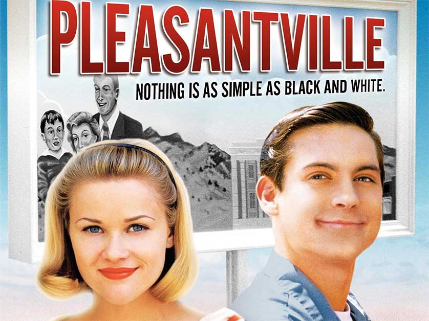
3.) Pleasantville
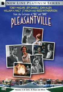
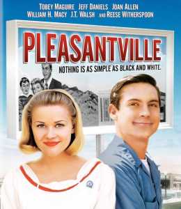
“Pleasantville” is one of my favorites, but it is a strange film in that the premise was old when the film was new. I can’t tell you how many TV shows I had already seen in elementary school that already had done the characters in the real world get sucked into a TV world. Like I’m shocked this wasn’t immediately laughed out of the studio office. However, there is one thing the film does very well which is take that simple done to death premise but really follow through with the concept. It’s not just as simple as the kids having to survive the show, they completely change it by their existence. The story even has a lot to say about the time period’s social changes that it satirizes. I really can’t say enough why I like the film so much. Now this is a case similar to “Near Dark” where the DVD cover is not exactly great, I myself am more of a fan of the original posters as they’re much more striking of images. However, the original DVD cover art does get the idea across.
However the new cover is awful, and particularly awful in that way of just show medium close-up shots of the famous actors. This is a common trend in posters that is just terrible. They never tell you what a film is about, they just tell you who is in it which should not be the primary focus of the poster. Also looking at the newer cover would you be able to tell what the premise is from the cover? It’s just two people in front of a black and white billboard, sure because I’ve seen the film already I know how it relates to each other but a random person looking for something to watch is going to have no idea and probably no reason to even pick up the DVD to turn it around to read the back. I mean would you, unless you’re a fan of the actors.















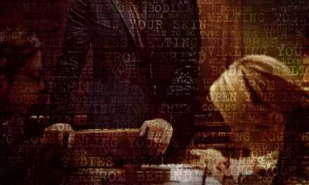
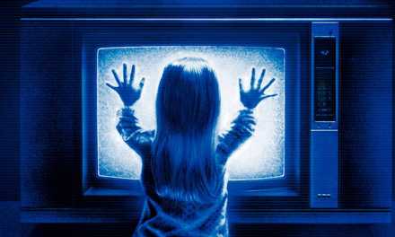


I like The frighteners a lot. Really a fun film and the original cover is outstanding. The new one looks so generic.
I hear a lot of people say the Director’s cut is better.
I’ll have to find that.